

(I worked on this project as Senior UX Strategist at Phase2)
During tax season, IRS.gov is the most used government website in America. But in 2016, with an aging platform, cumbersome user experience, and no mobile-friendly website, IRS.gov badly needed a refresh. Phase2’s user experience and content strategy team jumped into the trenches.
From 2016-17, I was the UX/IA Lead (User Experience / Information Architecture Lead) on a multi-organizational design team that redesigned IRS.gov’s homepage, major landing pages, site navigation and search. In addition to making the site faster and easier to use with fewer clicks and jargon, we added much-needed visual consistency with an up-to-date, responsive mobile design system.
My responsibilities on this team included:
- Spearheading navigation design work by visualizing a new organizational system, workshopping with stakeholders, conducting user research, presenting to clients, etc
- Leading the Information Architecture / User Experience (IA/UX) team, including prioritizing work, designing and assigning tasks to team members, reviewing and collaborating
- Working in partnership with the team’s UX Design Lead, Content Strategy Lead, Program Manager and government liasons to form a well-structured and contemporary vision for the new IRS.gov
With the massive scale of this project, we faced a lot of challenges. These included everything from the day-to-day constraints of working with a large government organization to the actual scope and breadth of the IRS’s content and services. There were a lot of surprises and setbacks, but every day we pushed forward and never gave up. Ultimately, we elevated the design and user experience of this major web presence significantly.
The Future Vision
When we kicked off the project, as the team’s UI futurist, I was asked to deliver a vision of what could be possible by leveraging service design thinking to a group that included the project leads and high-ranking government officials. We showcased how not only mobile access to IRS services would be possible, but also voice-enabled devices like Alexa could provide taxpayers with the critical information they needed without a single click. I love looking ahead beyond what’s possible today into the next big idea, and our whole team was brimming with excitement.

Homepage
For any big organization, redesigning the homepage is a Big Deal. Our research into the IRS.gov homepage included extensive interviews with subject matter experts, stakeholder workshops, and moderated in-person user research.

Ultimately, we crystallized a vision that would organize site visitors top tasks into no more than eight easy-to-tap buttons at the top of each page. Looking ahead, we also worked closely with government liaisons to established new content governance rules that would avoid future clutter.
Following are the results of some of the whiteboard sessions I moderated, then a low-resolution wireframe I sketched followed by corresponding polished wireframes made under my direction by a UX/IA team member. Finally, you can see a screenshot of the IRS.gov homepage as it is today.


Landing pages
Each of the top six section landing pages below the homepage was reorganized around the principle of putting top tasks in front of users, cutting repetition, and eliminating jargon where possible. I workshopped each of these pages with key stakeholders repeatedly until we refined each to a more streamlined design.


Navigation design and other information architecture
The previous structure of the IRS.gov website had no formal hierarchy, so creating a proper sitemap and navigational system was a major part of my work on this project. We built dozens of sitemaps and performed tree testing with users to determine their success, then iterated accordingly. Below are two small clips: one from a sitemap, the second from the findings of a tree test.


Because we were weaning the organization from a lot of organizational clutter, mega menus were a good approach from a change management perspective, in addition to providing user experience benefits. I led the content design of the mega menus in the wireframe and live screenshot below.


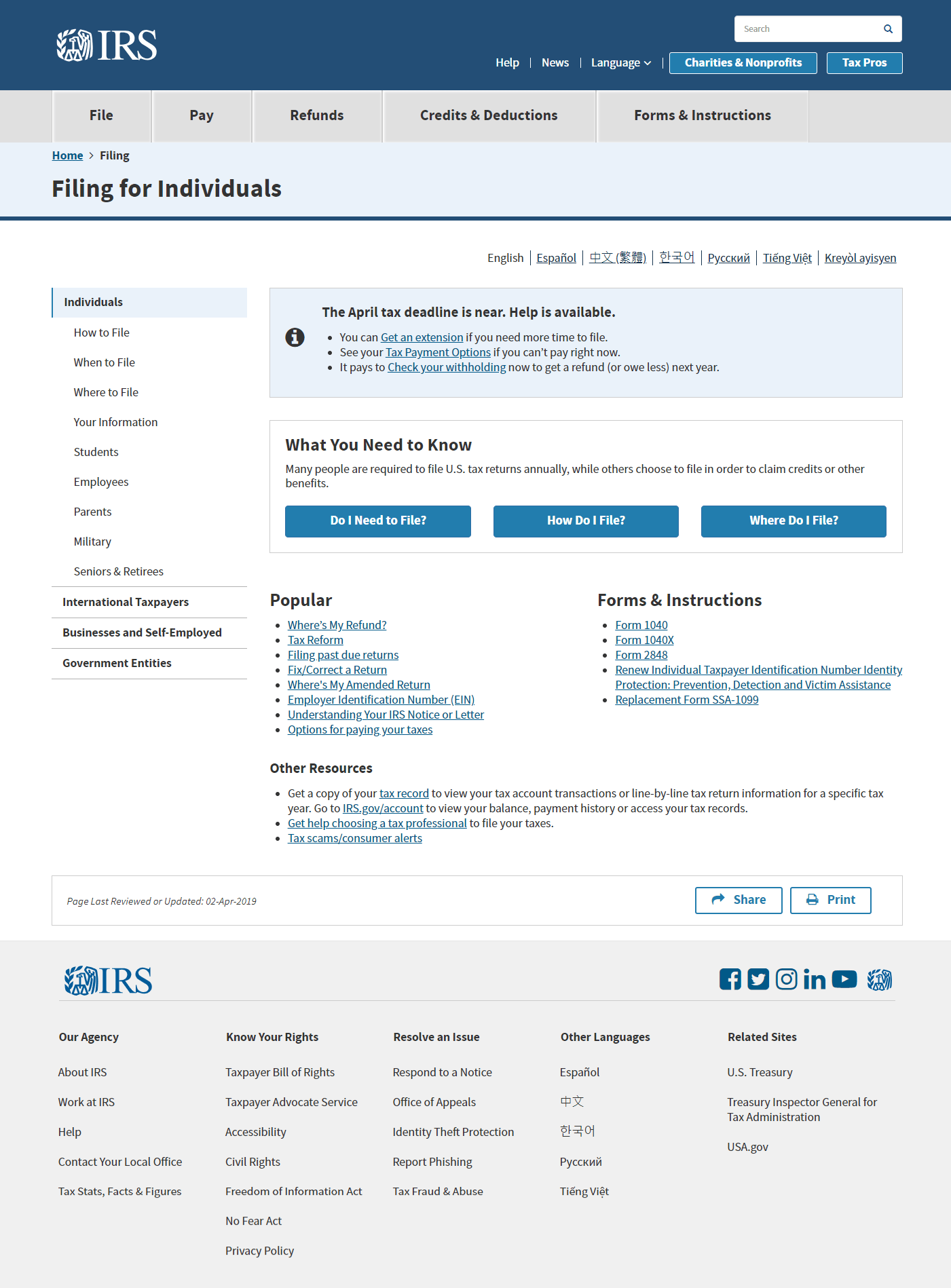
The previous site used sidebar lists on each page to mimic a structured left navigation. Because the new site would use a proper hierarchy page system, we needed to design a left nav bar that would logically display that hierarchy. In tandem with designing the structure of the nav bar, we worked closely with subject matter experts make sure the naming conventions were usable and low on jargon. Here are a few examples of the left sidebar wireframes I led the IA for, plus a live screenshot.


Are you looking to collaborate on something like this, or want to get in touch? Contact me here.


